Weekend
Weekend is a budgeting companion built for young people with plenty of reasons to feel financially stressed. As the gap between cost of living and wages widens, the simple longstanding math no longer maths, meaning budgeting feels less like a tool to be wielded and more like a test to be inevitably failed. In that environment traditional budgeting and the messaging around it can’t deliver. Control and confidence are empty promises without personalized guidance, tactics, and support to thread the needle. This is Weekend’s bread and butter.
Weekend needed a brand that could meet people in their current reality instead of promising a new one. The goal was to build an identity that could validate struggle and introduce levity without sacrificing credibility.
We partnered with the Weekend and Wildwood teams across strategy, naming, messaging, and visual identity to build a brand that doesn’t pretend the system is easy. The result is an identity that acknowledges stress, laughs through the absurdity, and offers a way forward anyway.
Services
Strategy
Naming
Messaging
Visual Identity
Illustration by Skyler Baker
By the time the basics are covered there just isn’t much left to manage, much less optimize. When you’re backed into a corner like that, budgeting feels a lot less like empowerment and a lot more like inevitable failure steeped in anxiety.
This is why doom-spending is talked and joked about. Why save? Why budget? Why attempt to build when the deck is stacked against you? Doom-spending is a small moment of control, but more than that it’s evidence of a lack of trust in the ability to accumulate at all.
Our brand idea, “Undoomed Budgeting,” bucks hopelessness. It became a foundation and a promise to meet financial stress and anxiety head-on without pretending it’s simply a discipline problem.
The brand idea trickled down into the tone of voice, which shifted the typical role of budgeting beyond the usual (and for Gen Z, empty) promises of control from an advisor. The brand needed to sound like a trusted friend. Someone that’s situationally aware, someone who isn’t dismissive, and someone who can nudge people towards better habits that ultimately determine spending.

The name Weekend is familiar and optimistic, shifting the narrative on budgeting from an act of restriction toward one of relief and possibility.
This was a major shift from the previous name, Sute, which signaled a much more traditional/institutional product.

The logotype is a balancing act between expression and credibility.
The overall impression is tidy and composed, but the details and individual glyphs are warm and friendly. The slanted crossbars of the e’s give a smile. The rounded arm of the k adds a softer and quirky touch. The unusually high-waisted d rounds the mark out with a certain plump impression.
Friendly without being adolescent, polished without being corporate—just like we drew it up.

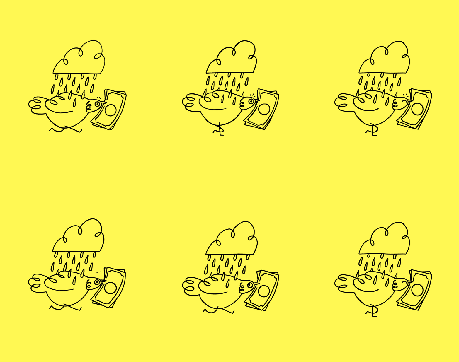
Smidgen the Pigeon is Weekend’s mascot. Why a pigeon? They’re scrappy, curious, and more intelligent than they get credit for. They didn’t get dealt the best hand in the animal kingdom, yet find their way through life through sheer determination and the occasional gift of bread from the lady on the bench.
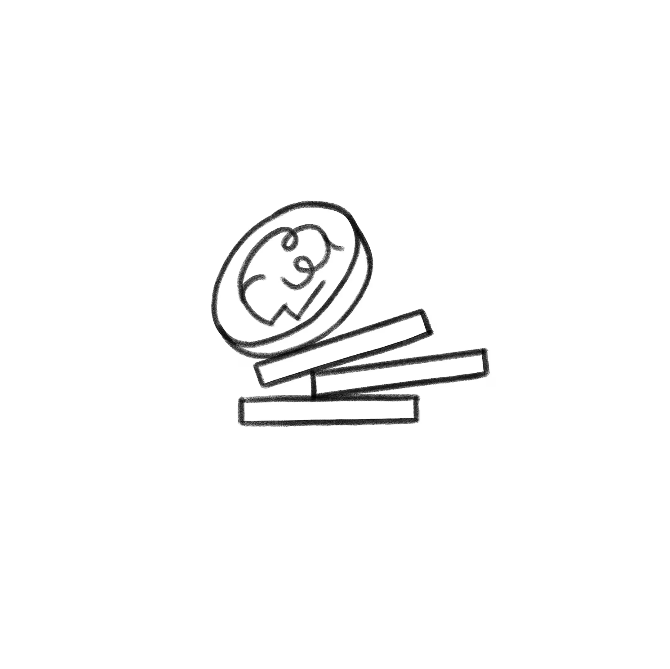
Smidgen gave us the ability to visualize budgeting in more emotional ways. Rather than up-arrows and bar charts, Smidgen stacks coins. Rather than UI visualization of low-balance alerts, Smidgen runs from a rain cloud.
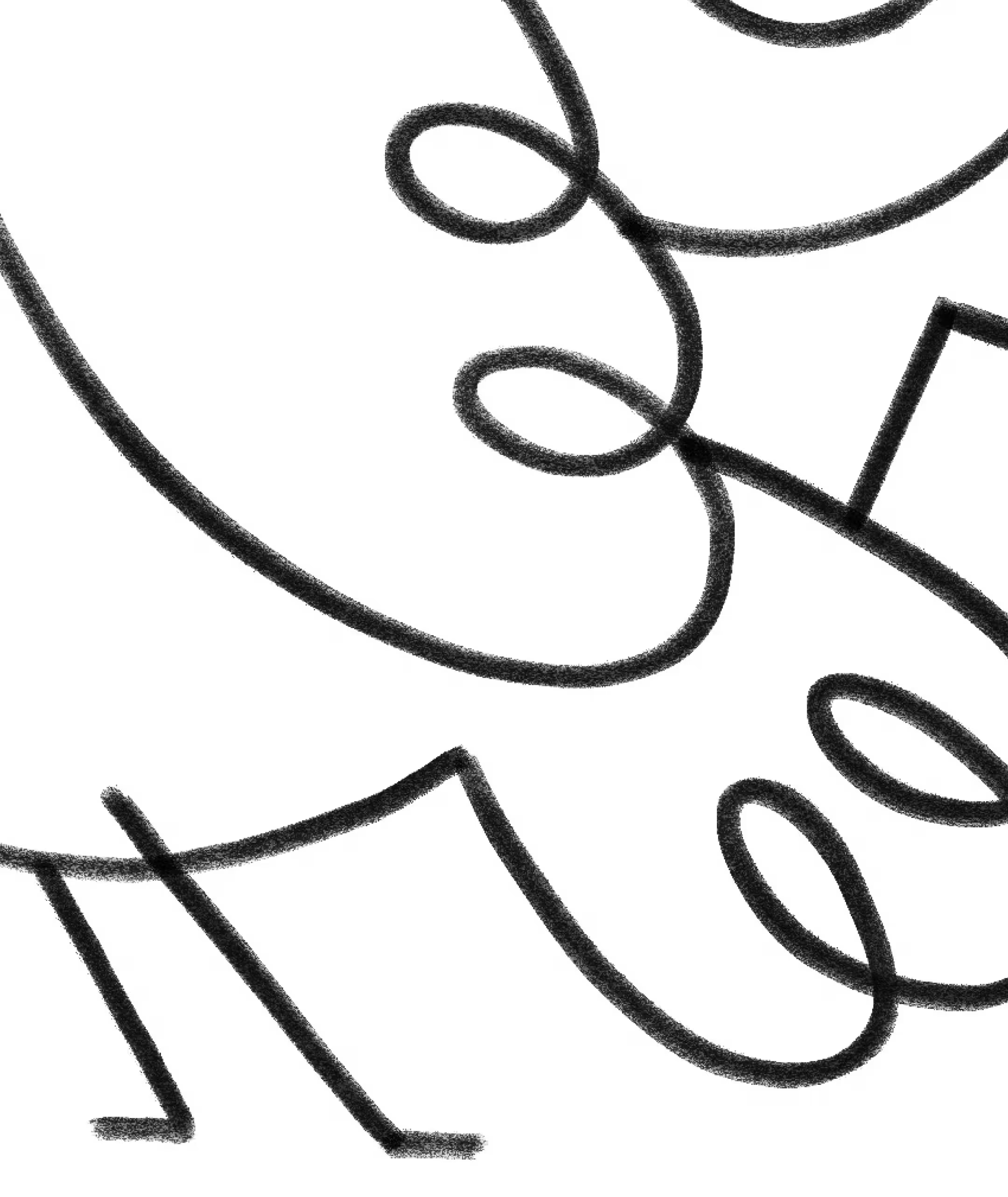
The brush style the embraces the same imperfections as the rest of the brand. The texture and consistency of the lines aren’t even. Intersections and joints aren’t perfectly resolved. Life isn’t linear or precise, nor are finances. Smidgen gives Weekend a symbol for all of that: imperfect, persistent, and finding a way through.